
Table of contents
Key Takeaways
- RGB and CMYK speak different color languages that affect how designs print.
- Color setup, proofing, and materials all shape the final result.
- Expert prep keeps colors true and designs consistent from screen to page.
Digital artwork isn’t print-ready by default. That surprises many professionals—what looks sharp on screen doesn’t always translate cleanly to print.
The reason: screens and ink “speak” different color languages..
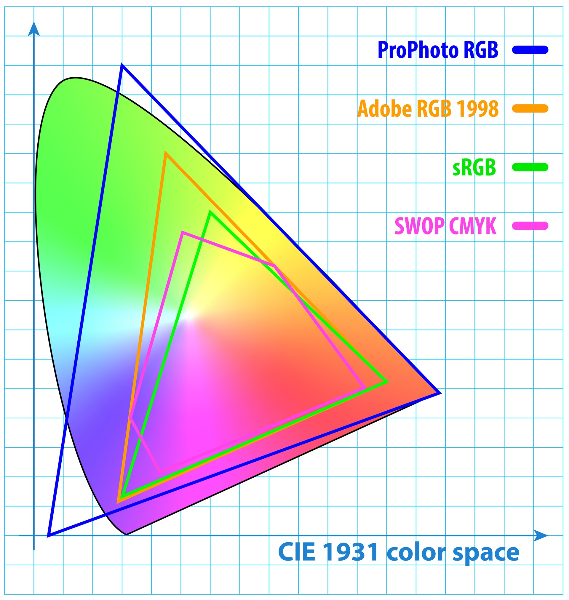
Most digital files are built in RGB (Red, Green, Blue), the color mode used for screens. RGB can display a wider range of colors than CMYK (Cyan, Magenta, Yellow, Black), which is the standard for print.
The shift from RGB to CMYK is where pixels turn into pigment—the moment your digital vision starts living on paper. Even a subtle variation can change how every color, shadow, and highlight comes to life.
The Problem with a Simple Conversion
If you’ve ever printed something that looked off—dull reds, murky shadows, or unexpected shifts in tone—chances are the file was exported directly from an RGB format without review.
Most design tools allow quick one-click conversions to CMYK, but that doesn’t account for:
- Brightness and contrast
- Color saturation
- Highlight or shadow detail
- Paper or printer differences
What looks great on your monitor might not hold up in print, especially if you’re aiming for high-quality results.
What’s the difference between RGB and CMYK?
Imagine this: your neon logo glows on screen, but prints flat and dull. That’s the RGB vs. CMYK difference in action.
- RGB (Red, Green, Blue): Used for digital screens - produces bright, vivid colors.
- CMYK (Cyan, Magenta, Yellow, Black): Used for printing - has a smaller color range.
When converting an RGB image to CMYK, certain bright tones—especially greens, blues, and reds—can lose intensity or shift in hue. Quick conversions often produce uneven color results between digital and print.
What Actually Affects Print Quality
To produce accurate, consistent print results, you need to understand how your files interact with materials and equipment.
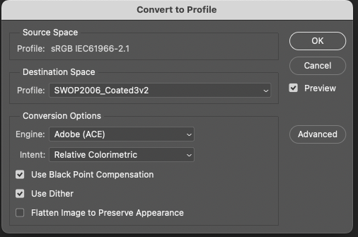
Color Profiles:
ICC profiles map digital colors to print output, varying by printer, ink, and paper.
Soft Proofing:
Soft proofing shows how the image will appear once printed, allowing targeted adjustments before production.
Paper and Coating Choices:
Glossy, matte, or textured paper absorbs ink differently, affecting how your piece looks and feels.
Ink Type and Print Method:
Offset and digital printers behave differently, and inks suit specific materials. Early detection prevents surprises and keeps visuals consistent.
Lighting Conditions:
Colors shift depending on the environment. Consider where your piece will appear - indoors, outdoors, or anywhere it’s meant to stand out.
Preparing an RGB Image for Print
Before printing, digital artwork must be reviewed and adjusted for print output:
- Applying the correct ICC color profile for the printer and paper type
- Soft proofing to preview how the design will look once printed
- Adjusting color balance, highlights, and shadows manually
- Preparing files based on final output conditions, such as offset or digital print methods, and paper stock (matte, glossy, uncoated)
In short, make sure your creative looks the way it was meant to—on screen and on paper.
Why Proper Preparation Matters
You’ve already invested time and resources into creating high-quality work. If that work is going to live beyond a screen—whether in print ads, editorial spreads, catalogs, or packaging—it's worth handling that transition with care.
Skipping steps or relying on default settings might be fine for casual projects. But if you’re producing materials for a brand, publication, or campaign, accuracy counts. What’s seen on the page should match what was intended at the concept stage.
How to avoid print issues
To get consistent and accurate results from digital-to-print workflows:
- Never rely on auto-conversions alone
- Work with professionals who understand prepress standards
- Always preview artwork in CMYK and soft-proofed format
- Use files that are prepared with the final print specs in mind
Attention to detail prevents reprints, delays, and off-brand color results.
Professional Support for Print Design
At Continuum, our team blends technical precision with creative insight to keep print work accurate and consistent. In an increasingly digital world, we help brands translate digital creativity into print with confidence.
If your team builds digital-first content but wants print work that commands attention, we bring the expertise and precision that elevate every detail.
FAQs
- Why do my printed colors look different than on screen?
Screens use RGB and printers use CMYK, which has a smaller color range. Without proper conversion and adjustment, printed colors may appear dull or inaccurate. - Can I just convert RGB to CMYK and print?
You can, but the results may not be accurate. Professional file prep includes color correction, soft proofing, and printer-specific adjustments. - What’s soft proofing?
Soft proofing is a digital preview of how your design will look in print. It helps catch color and detail issues before printing. - Do I need different files for different paper types?
Yes. Paper texture and coating affect how ink behaves. File adjustments should be made based on the final paper and printing method.